All projects

Personal project

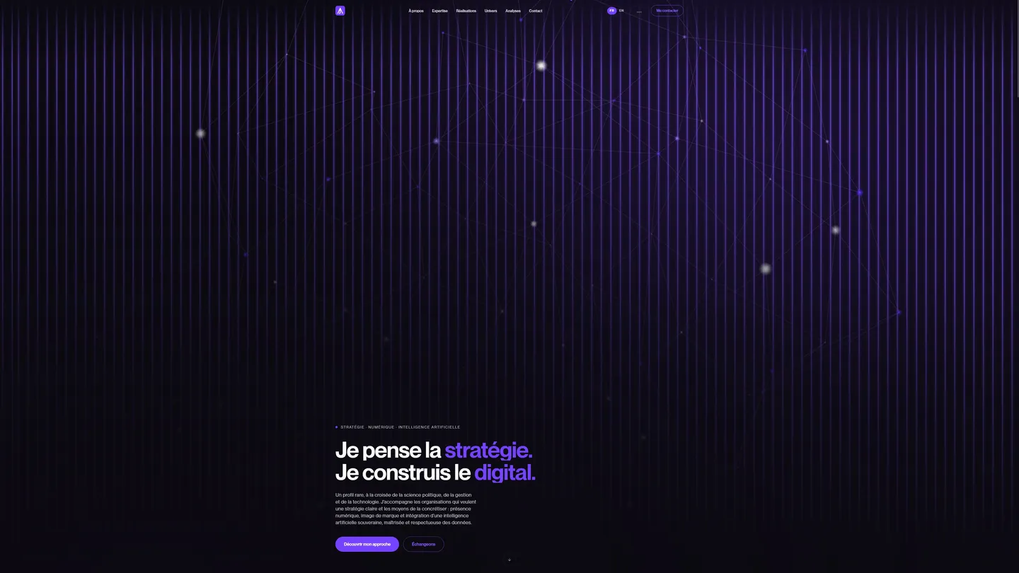
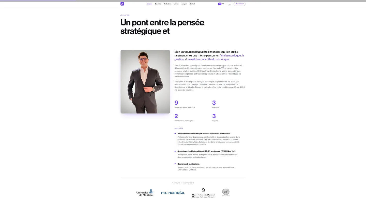
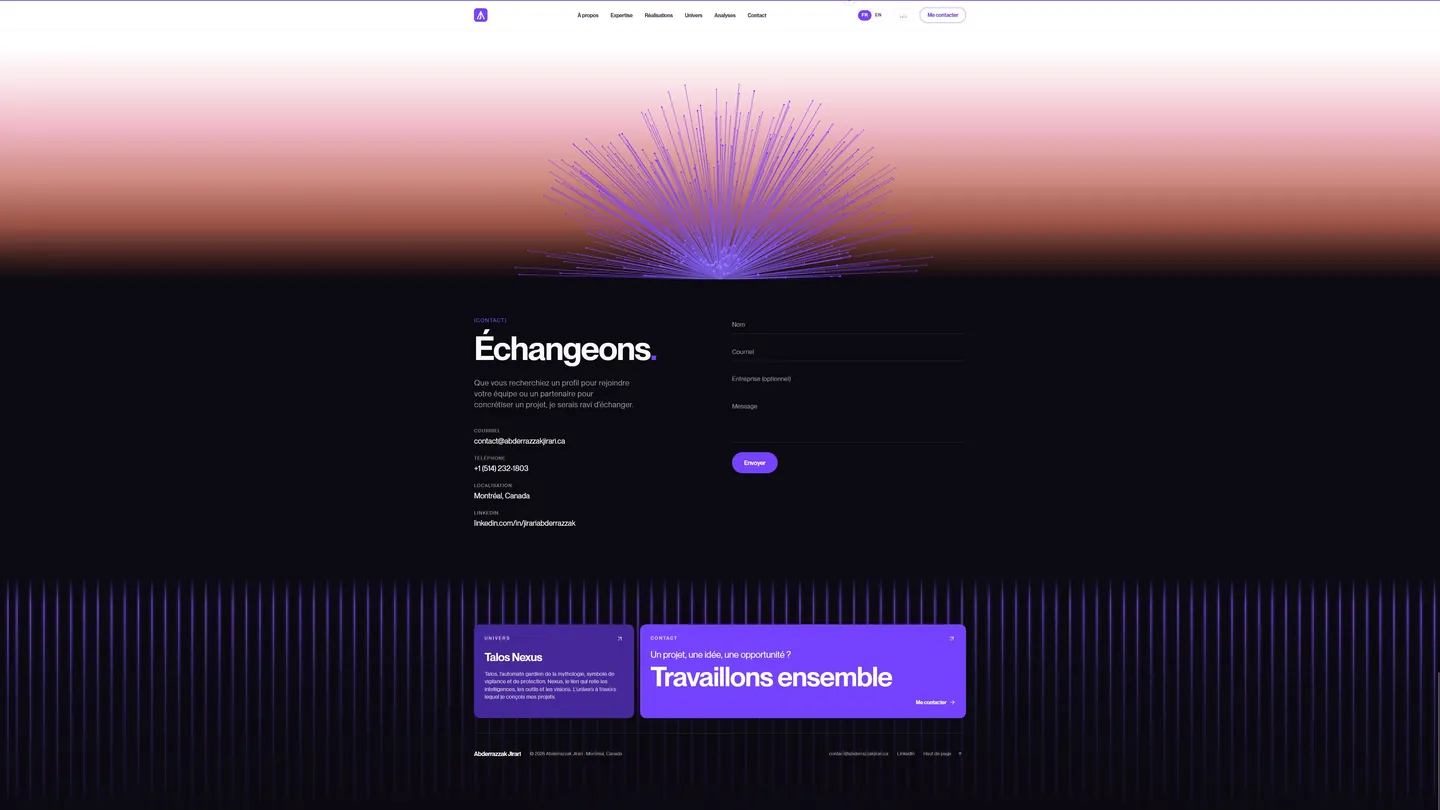
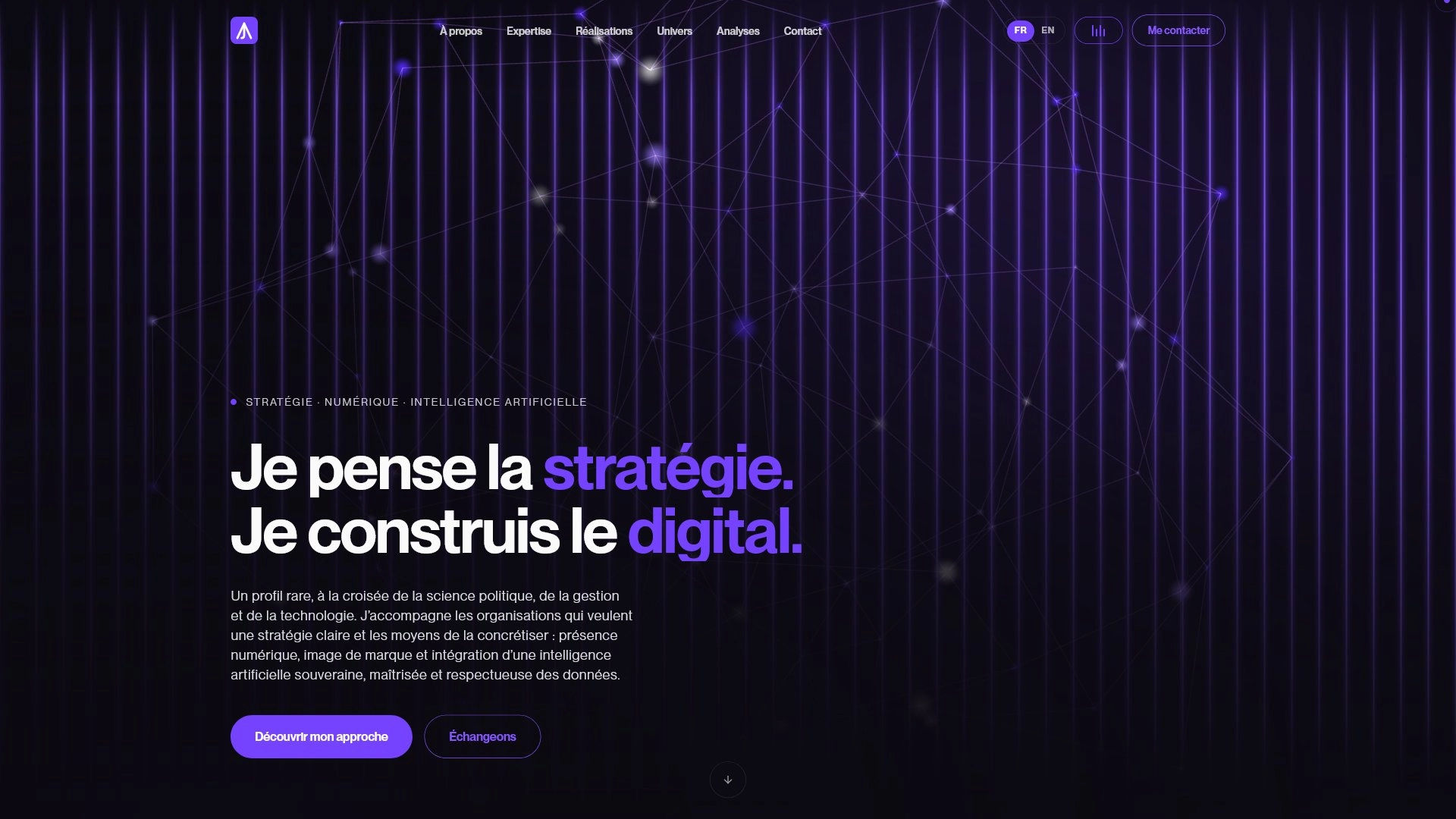
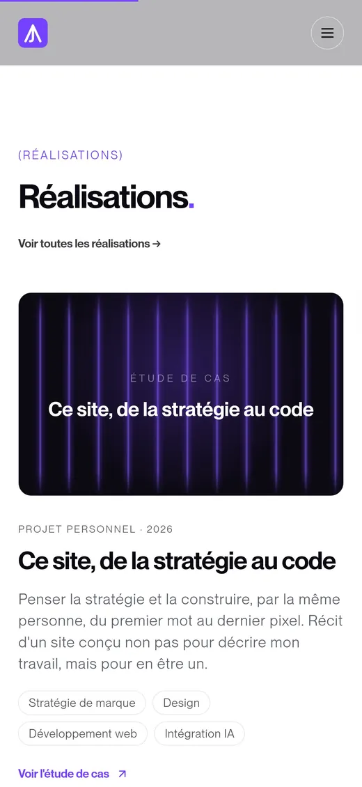
This site, from strategy to code.

Intent
The living demonstration of what I can do: uniting strategic thinking, visual design, and technical execution.
Context
Personal project
Year
2026
Role
Strategy, design, and development
Disciplines
Brand strategyDesignWeb developmentAI integration

A personal site often settles for describing a career path. I wanted mine to do something else: to make you feel, in a few seconds, the way I think and the way I work. Designing it, drawing it, and building it myself, from strategy to code, wasn't an exercise in style. It was the demonstration.

The challenge

I already had a site, on WordPress. It worked. But it didn't look like me.

The problem wasn't the tool itself: WordPress remains relevant for many needs. The problem was the gap between what I wanted to convey and what the platform let me do. Every theme imposes its own logic, every slightly bold ambition runs into a limit, into one more plugin, into one more slowdown. The moment identity, custom animations, and performance become requirements, the tool stops being a lever and becomes a brake.

And I had an unusual challenge from the start. My profile fits no box: it crosses political analysis, management, and hands-on mastery of digital. How do you present that without falling into the interchangeable portfolio? And how do you prove that you think strategy and build it, instead of merely claiming it?

The conclusion became clear: the site wouldn't talk about my work, it would be a piece of it.

My approach

I started where I always start: with strategy, never with technique.

Before a single line of code, I set a clear direction. A hybrid, fully owned positioning, with a differentiating angle: sovereign AI, controlled and respectful of data. It was that direction, not an aesthetic trend, that governed every decision afterward. The homepage promise, "I think strategy. I build digital.", sets the course the rest of the site has to hold.

I then addressed a dimension we often neglect: feel. A visitor forms an opinion in a few seconds, before even reading a sentence. So I chose a demanding art direction, a dark world, a signature purple, an assertive typography, a rhythm of sections in chiaroscuro, so that at first glance the site gives off seriousness, modernity, and mastery. Get it right before making it pretty.

Key decisions

Custom-built rather than templated. Full development gave me back total control: over identity, over performance, over every interaction. It's a conviction I carry beyond my own case: when identity and performance come first, custom isn't a luxury, it's the right answer.

One hand, from vision to code. Where an agency splits strategy, design, and development across several teams, this site was conceived and built by the same person, from start to finish. Nothing was lost along the way: the initial intent is found intact in the result.

One brand, one world. I built the site around a single idea, connection, right down to the homepage animation: a constellation of linked points, a metaphor for the network, for intelligence, and for the bringing together of ideas. Form serves substance.

Artificial intelligence, as an honest differentiator. I made it a pillar in its own right, presented with candor: what I concretely master, and what I approach with caution. Credibility is earned through accuracy, not through showing off.

Under the hood

For the more technical eye, here's what drives the site.

It's built with Next.js and React, designed from the ground up for performance and search visibility: static rendering of pages, structured metadata (Open Graph, JSON-LD structured data), a careful sitemap and markup.

The homepage animation relies on WebGL on desktop, with fully controlled degradation: a lighter SVG and CSS version on mobile, with no heavy library sent to phones, and a static version for people sensitive to motion, respecting the system's accessibility preferences. Every effect is designed never to cost performance or reading comfort.

The content, insights and projects alike, rests on a file-based system: publishing comes down to dropping in a file, without touching the code. The images are optimized, and the whole thing was checked pixel by pixel on every screen size, without the slightest overflow.

Nothing is left to chance. Nothing is superfluous.

The result

This site is exactly what it had to be: proof that I design a project end to end and build it myself, from the first strategic intent to the last pixel.

It also carries a conviction that goes beyond my own case. Too many organizations stay prisoners of tools that constrain them more than they serve them. Taking back control of your site isn't a technical decision: it's taking back control of your identity, your performance, and your message. If this situation speaks to you, it's exactly the kind of transition I know how to lead, from vision to code.

What I take from it

Building this site confirmed one thing for me: coherence isn't declared, it's built with every decision. When the same person holds the strategy, the design, and the code, nothing dilutes between the stages, and the result carries a single intent from beginning to end.

I also take from it that technical constraint is never neutral. The tool you choose shapes what you can say. Taking back control of your own is giving yourself the right to be demanding again.